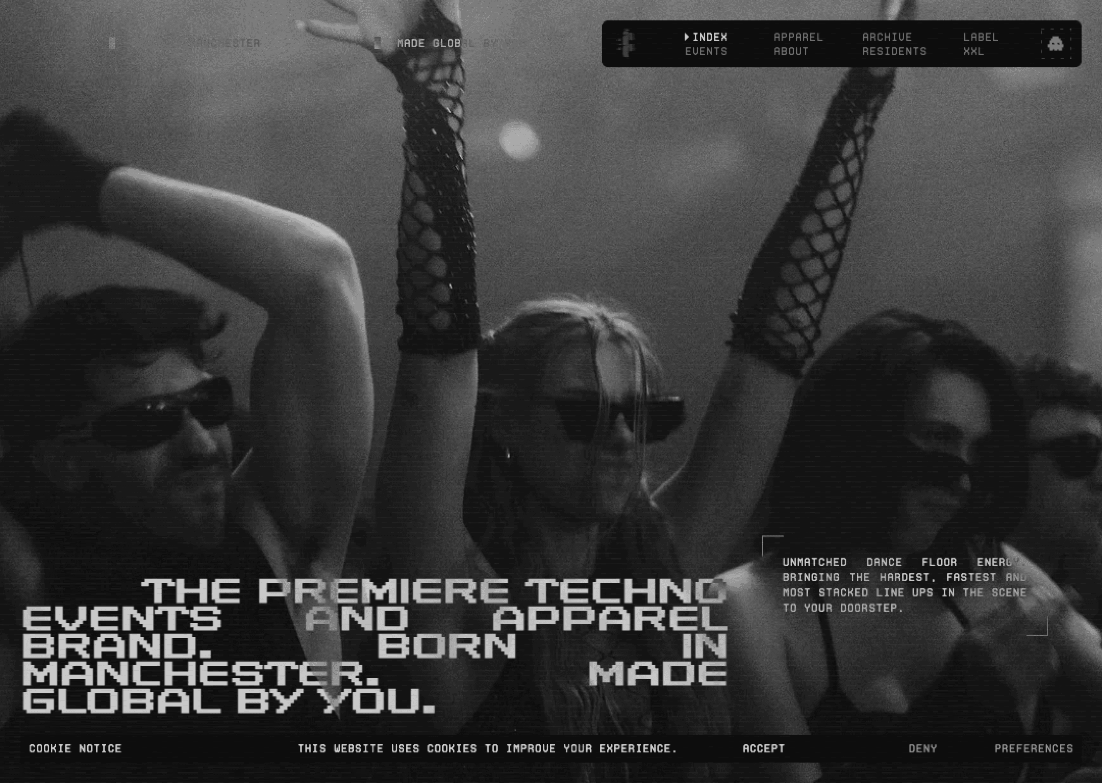


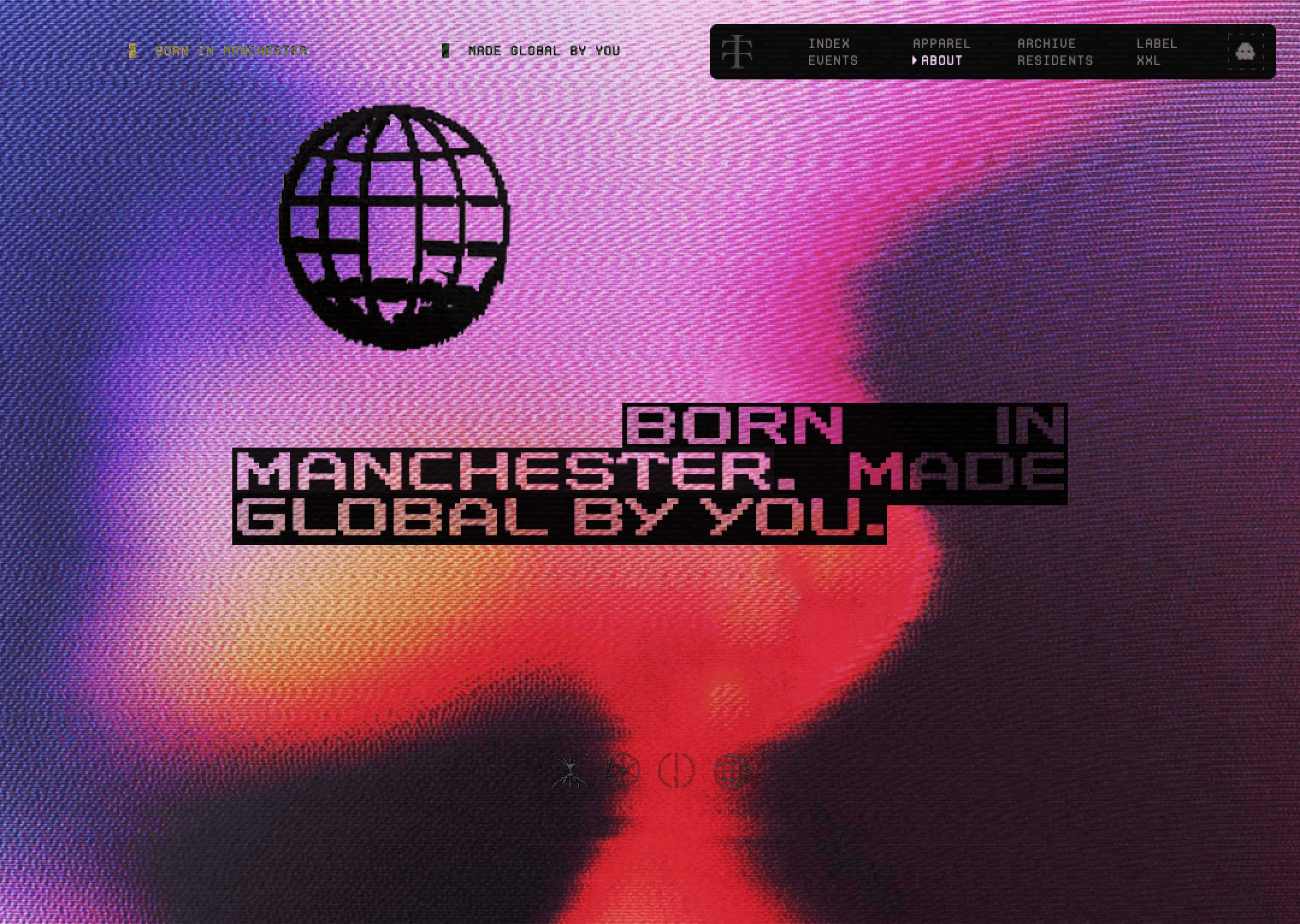


The immediate impression is density. Dark backgrounds, neon accents, and large typography compress the space and accelerate the pace. The layout favors information hierarchy over breathing room. Whitespace exists, but it’s functional, not expressive — keeping the user in a constant reading mode.
The site’s attitude is direct and utilitarian. It clearly states what the event is, what’s happening, and why you should care. There’s little narrative softness. For casual browsing, it may feel heavy, but for goal-oriented visitors, it’s efficient. The experience feels like an event dashboard — focused, purposeful, and action-driven.