


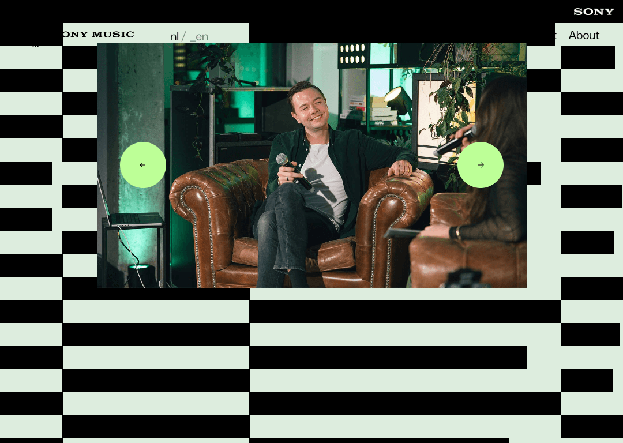

This site feels loud in content but controlled in design. The UI carries the confidence of a major label—nothing hesitant, nothing experimental for its own sake. Typography is bold and functional, designed to support names, titles, and releases rather than express personality. Artist imagery dominates the experience, setting the emotional tone and reminding you that the brand exists to amplify talent, not overshadow it.
Motion is quick and responsive, reinforcing a sense of momentum and relevance. Interactions feel efficient and familiar, prioritizing access over exploration. The layout is structured and predictable, helping users move fast between artists, news, and releases. Whitespace is managed tightly, making room for visual impact without feeling cluttered. Overall, the experience feels professional, energetic, and authoritative—design that knows its position and executes with confidence rather than experimentation.