


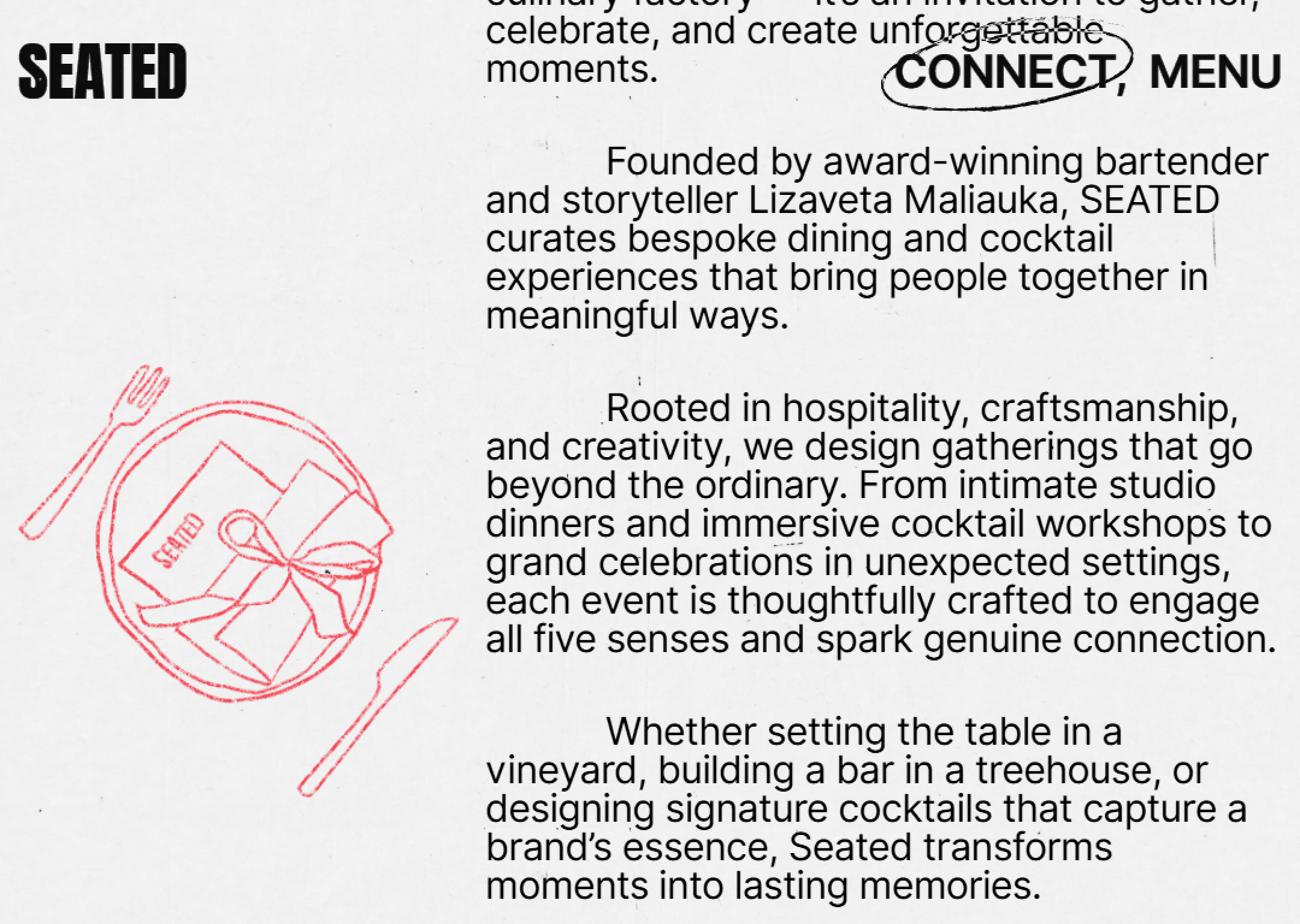


Seated immediately feels lively and city-driven, like a service designed for people who are always moving. Typography is bold and confident, setting an energetic tone without becoming aggressive. Food photography feels real and appetizing, leaning more toward authenticity than polish. The UI balances personality and clarity, making it easy to trust while still feeling fun.
Interactions are quick and responsive, reinforcing a sense of efficiency. Motion is subtle but purposeful, mainly supporting feedback and flow. The layout is clean and structured, helping users scan and act quickly. Whitespace is comfortable rather than luxurious, keeping the interface light and readable. Overall, the experience feels practical, energetic, and well-tuned to urban habits.