
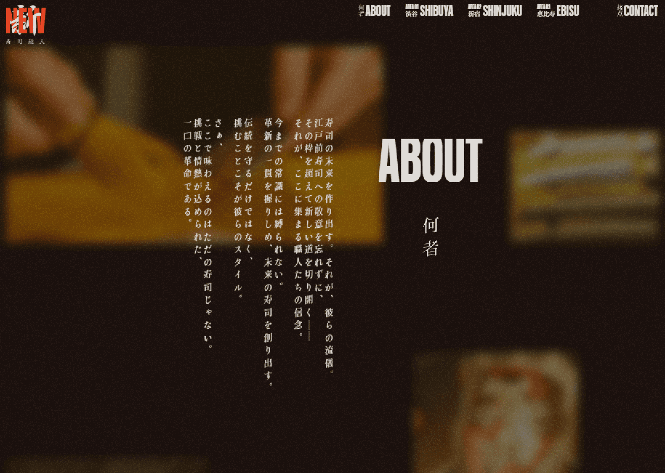


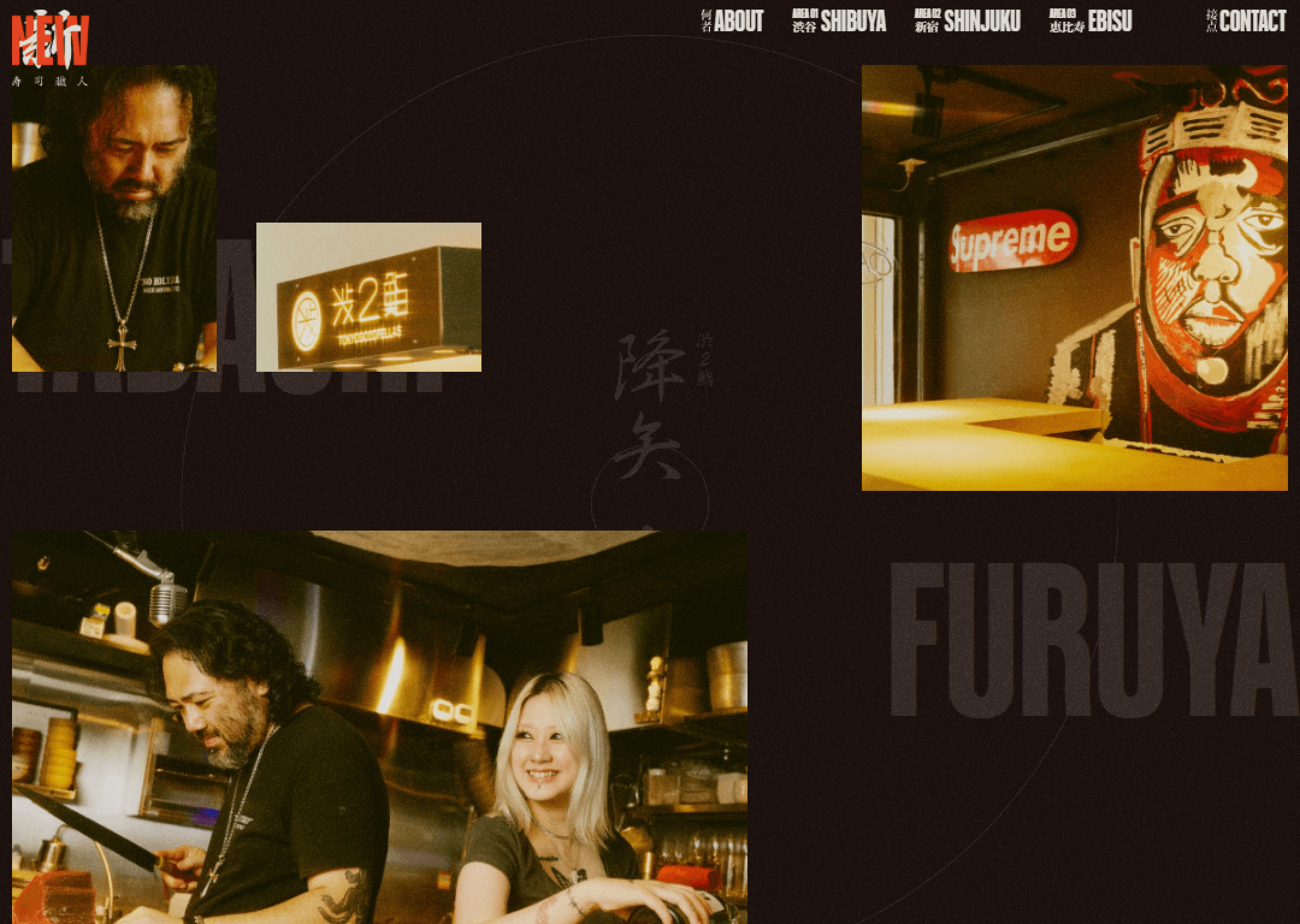

The site hits immediately. Large typography, strong contrast, and decisive composition create visual tension. This is not traditional Japanese restraint; it feels editorial and contemporary, with deliberate clashes between text, imagery, and space. The layout doesn’t guide gently — it demands attention.
The website’s attitude is declarative. It doesn’t try to sell sushi or explain it. For users seeking quick information, this may feel abrasive. But as an experience, it’s compelling. It reads like an editorial statement about modern food culture rather than a restaurant introduction.