

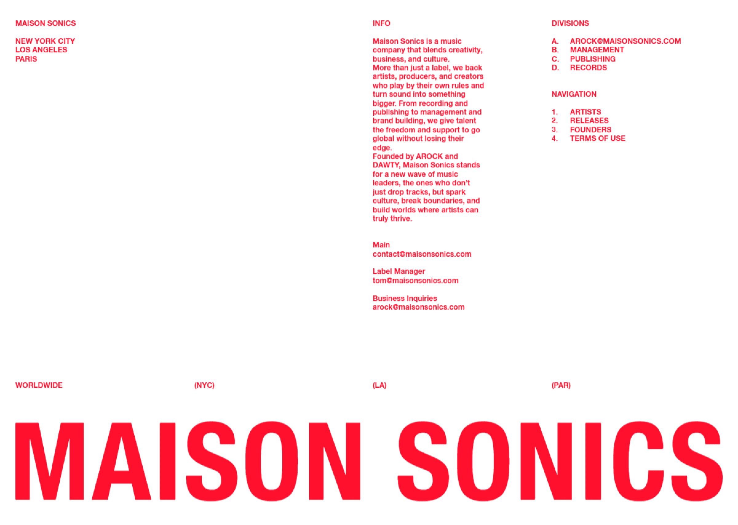


The first thing that settles in is the use of text color. Typography doesn’t shout; it carries tone. The palette gives the words weight without heaviness, creating clarity and elegance at the same time. The layout is simple, almost restrained, but every decision feels intentional. Nothing is decorative for its own sake, and nothing feels missing.
The horizontal scroll introduces a gentle disruption, just enough to refresh attention without breaking flow. On the homepage, the four-image artist introduction is especially effective — balanced, confident, and immediately communicative. It presents artists as presence, not profiles. The website’s attitude is calm and assured. It doesn’t rush, doesn’t persuade aggressively. The experience feels curated, thoughtful, and quietly memorable.