



Category
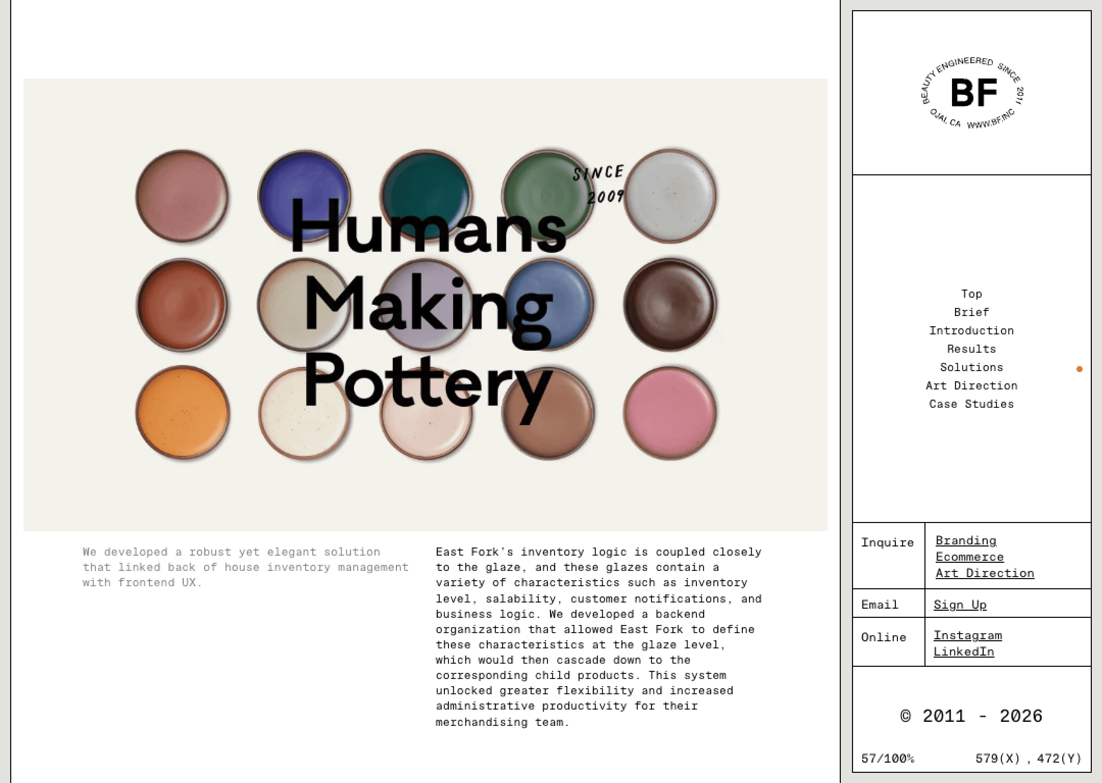
BF.inc feels opinionated the moment it loads. The UI carries a strong attitude, mixing restraint with moments of visual disruption. Typography is confident without shouting, and graphic elements introduce tension rather than decoration. Visuals feel designed to provoke curiosity instead of comfort, suggesting a studio that values thinking over polish.
Motion is intentional and expressive, used to create rhythm rather than spectacle. Interactions feel considered, sometimes unexpected, reinforcing the sense of experimentation. The layout plays with structure, occasionally breaking symmetry to keep things unsettled. Whitespace is used strategically to isolate ideas and heighten contrast. Overall, the experience feels bold, self-aware, and creatively restless.